Bootstrap 4 Cards
Cards
Card ở Bootstrap 4 là một box có viền với một số nội dung bên trong. Nó bao gồm các tùy chọn cho headers, footers, content, colors, vv.
Basic Card
Một basic card được tạo bởi class .card, và nội dung bên trong card có class .card-body:
Ví dụ
<div class="card">
  <div class="card-body">Basic card</div>
</div>
Header và Footer
Class .card-header add header cho card và .card-footer add footer cho card:
Ví dụ
<div class="card">
  <div class="card-header">Header</div>
  <div class="card-body">Content</div>
  <div class="card-footer">Footer</div>
</div>
Contextual Cards
Để add background color cho card, sử dụng thêm các class sau (.bg-primary, .bg-success, .bg-info, .bg-warning, .bg-danger, .bg-secondary, .bg-dark và .bg-light.
Titles, text, và links
Sử dụng .card-title để tạo titles cho header. Class .card-text được dùng để loại bỏ margin-bottom của thẻ <p> nếu nó là last-child (hoặc có duy nhất nó) bên trong .card-body. Class .card-link thêm màu blue cho link, và hiệu ứng hover.
Ví dụ
<div class="card">
  <div class="card-body">
    <h4 class="card-title">Card title</h4>
    <p class="card-text">Some example text. Some example text.</p>
    <a href="#" class="card-link">Card link</a>
    <a href="#" class="card-link">Another link</a>
  </div>
</div>
Card Images
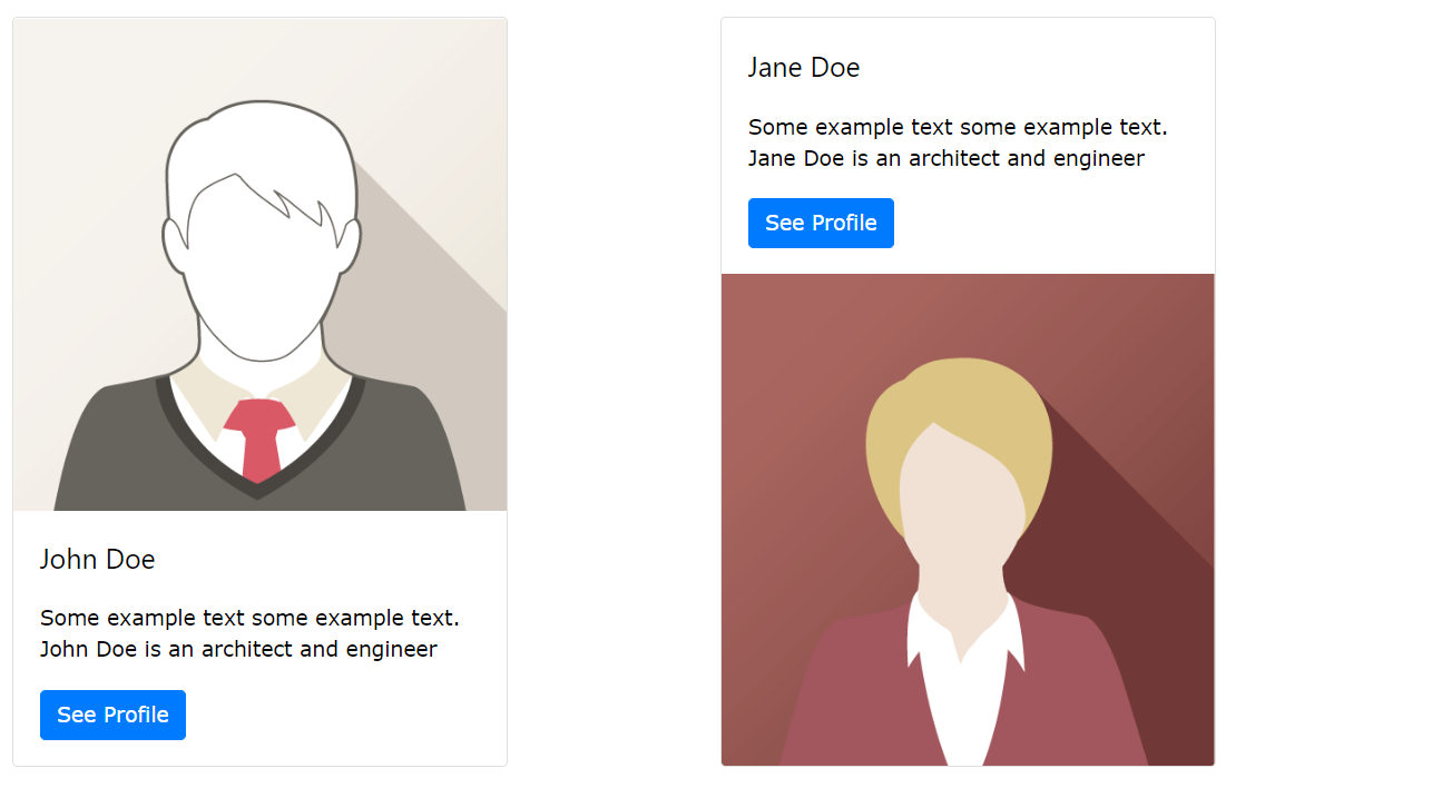
Add .card-img-top hoặc .card-img-bottom cho thẻ <img> để đặt ảnh trên cùng hoặc dưới cùng bên trong card. Lưu ý rằng thêm hình ảnh bên ngoài .card-body để mở rộng toàn bộ chiều rộng:
Ví dụ
<div class="card" style="width:400px">
  <img class="card-img-top" src="img_avatar1.png" alt="Card image">
  <div class="card-body">
    <h4 class="card-title">John Doe</h4>
    <p class="card-text">Some example text.</p>
    <a href="#" class="btn btn-primary">See Profile</a>
  </div>
</div>
Stretched Link
Add class .stretched-link vào link bên trong card, và nó sẽ làm cho toàn bộ card có thể nhấp và hover được (thẻ sẽ hoạt động như một link):
Ví dụ
<a href="#" class="btn btn-primary stretched-link">See Profile</a>Card Image Overlays
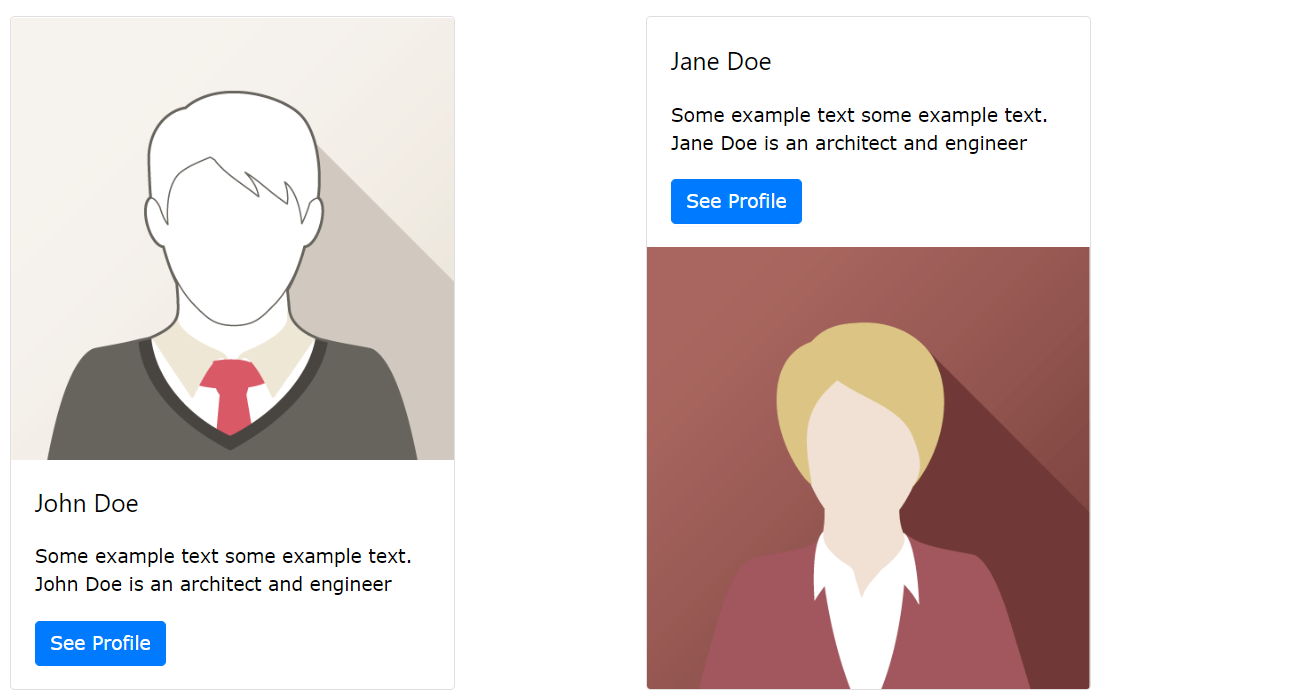
Biến hình ảnh thành ảnh nền cho card và sử dụng .card-img-overlay để add text trên cùng của hình ảnh:
Ví dụ
<div class="card" style="width:500px">
  <img class="card-img-top" src="img_avatar1.png" alt="Card image">
  <div class="card-img-overlay">
    <h4 class="card-title">John Doe</h4>
    <p class="card-text">Some example text.</p>
    <a href="#" class="btn btn-primary">See Profile</a>
  </div>
</div>
Card Columns
Some text inside the first card
Some text inside the second card
Some text inside the third card
Some text inside the fourth card
Some text inside the fifth card
Some text inside the sixth card
Class .card-columns tạo ra một mạng lưới thẻ (kiểu pinterest). Bố cục sẽ tự động điều chỉnh khi bạn chèn thêm card.
Chú ý: Các thẻ được hiển thị theo chiều dọc trên màn hình nhỏ (dưới 576px):
Ví dụ
<div class="card-columns">
  <div class="card bg-primary">
    <div class="card-body text-center">
      <p class="card-text">Some text inside the first card</p>
    </div>
  </div>
  <div class="card bg-warning">
    <div class="card-body text-center">
      <p class="card-text">Some text inside the second card</p>
    </div>
  </div>
  <div class="card bg-success">
    <div class="card-body text-center">
      <p class="card-text">Some text inside the third card</p>
    </div>
  </div>
  <div class="card bg-danger">
    <div class="card-body text-center">
      <p class="card-text">Some text inside the fourth card</p>
    </div>
  </div>
  <div class="card bg-light">
    <div class="card-body text-center">
      <p class="card-text">Some text inside the fifth card</p>
    </div>
  </div>
  <div class="card bg-info">
    <div class="card-body text-center">
      <p class="card-text">Some text inside the sixth card</p>
    </div>
  </div>
</div>
Card Deck
Some text inside the first card
Some more text to increase the height
Some more text to increase the height
Some more text to increase the height
Some text inside the second card
Some text inside the third card
Some text inside the fourth card
Class .card-deck tạo ra một lưới các thẻ có chiều cao và chiều rộng bằng nhau. Bố cục sẽ tự động điều chỉnh khi bạn chèn thêm thẻ.
Chú ý: Các thẻ được hiển thị theo chiều dọc trên màn hình nhỏ (dưới 576px):
Ví dụ
<div class="card-deck">
  <div class="card bg-primary">
    <div class="card-body text-center">
      <p class="card-text">Some text inside the first card</p>
    </div>
  </div>
  <div class="card bg-warning">
    <div class="card-body text-center">
      <p class="card-text">Some text inside the second card</p>
    </div>
  </div>
  <div class="card bg-success">
    <div class="card-body text-center">
      <p class="card-text">Some text inside the third card</p>
    </div>
  </div>
  <div class="card bg-danger">
    <div class="card-body text-center">
      <p class="card-text">Some text inside the fourth card</p>
    </div>
  </div>
</div>
Card Group
Some text inside the first card
Some more text to increase the height
Some more text to increase the height
Some more text to increase the height
Some text inside the second card
Some text inside the third card
Some text inside the fourth card
Class .card-group cũng tương tự với .card-deck. Sự khác biệt duy nhất là .card-group loại bỏ margin left và right giữa mỗi card.
Chú ý: Các thẻ được hiển thị theo chiều dọc trên màn hình nhỏ (dưới 576px), với margin top và bottom:
Ví dụ
<div class="card-group">
  <div class="card bg-primary">
    <div class="card-body text-center">
      <p class="card-text">Some text inside the first card</p>
    </div>
  </div>
  <div class="card bg-warning">
    <div class="card-body text-center">
      <p class="card-text">Some text inside the second card</p>
    </div>
  </div>
  <div class="card bg-success">
    <div class="card-body text-center">
      <p class="card-text">Some text inside the third card</p>
    </div>
  </div>
  <div class="card bg-danger">
    <div class="card-body text-center">
      <p class="card-text">Some text inside the fourth card</p>
    </div>
  </div>
</div>
Tags:
Phản hồi từ học viên
5
(Dựa trên đánh giá ngày hôm nay)