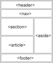
HTML Layout Elements and Techniques - Các thành phần bố cục và kĩ thuật trong HTML
Các trang web thường hiển thị nội dung trong nhiều cột (như một tạp chí hoặc tờ báo).
ví dụ
<!DOCTYPE html>
<html lang="en">
<head>
<title>CSS Template</title>
<meta charset="utf-8">
<meta name="viewport" content="width=device-width, initial-scale=1">
<style>
* {
box-sizing: border-box;
}
body {
font-family: Arial, Helvetica, sans-serif;
}
/* Style the header */
header {
background-color: #666;
padding: 30px;
text-align: center;
font-size: 35px;
color: white;
}
/* Create two columns/boxes that floats next to each other */
nav {
float: left;
width: 30%;
height: 300px; /* only for demonstration, should be removed */
background: #ccc;
padding: 20px;
}
/* Style the list inside the menu */
nav ul {
list-style-type: none;
padding: 0;
}
article {
float: left;
padding: 20px;
width: 70%;
background-color: #f1f1f1;
height: 300px; /* only for demonstration, should be removed */
}
/* Clear floats after the columns */
section:after {
content: "";
display: table;
clear: both;
}
/* Style the footer */
footer {
background-color: #777;
padding: 10px;
text-align: center;
color: white;
}
/* Responsive layout - makes the two columns/boxes stack on top of each other instead of next to each other, on small screens */
@media (max-width: 600px) {
nav, article {
width: 100%;
height: auto;
}
}
</style>
</head>
<body>
<h2>CSS Layout Float</h2>
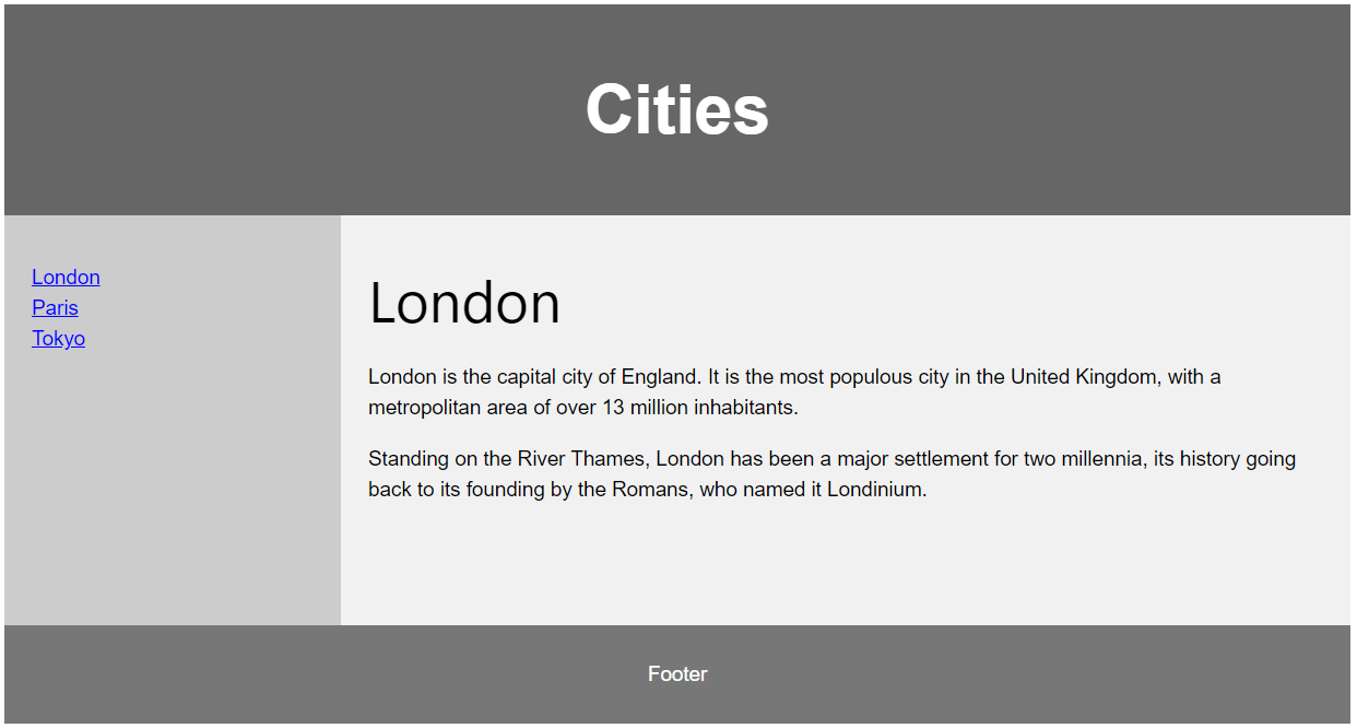
<p>In this example, we have created a header, two columns/boxes and a footer. On smaller screens, the columns will stack on top of each other.</p>
<p>Resize the browser window to see the responsive effect (you will learn more about this in our next chapter - HTML Responsive.)</p>
<header>
<h2>Cities</h2>
</header>
<section>
<nav>
<ul>
<li><a href="#">London</a></li>
<li><a href="#">Paris</a></li>
<li><a href="#">Tokyo</a></li>
</ul>
</nav>
<article>
<h1>London</h1>
<p>London is the capital city of England. It is the most populous city in the United Kingdom, with a metropolitan area of over 13 million inhabitants.</p>
<p>Standing on the River Thames, London has been a major settlement for two millennia, its history going back to its founding by the Romans, who named it Londinium.</p>
</article>
</section>
<footer>
<p>Footer</p>
</footer>
</body>
</html>
Các thành phần bố cục trong HTML
HTML cung cấp một số thành phần có ngữ nghĩa để xác định các phần khác nhau của trang web:
Kĩ thuật bố trí HTML
Có bốn kĩ thuật khác nhau để tạo các bố cục nhiều cột. Mỗi cách đều có ưu và nhược điểm:
- CSS framework
- CSS thuộc tính float
- CSS flexbox
- CSS grid
CSS Frameworks
Nếu bạn muốn tạo một bố cục nhanh chóng, bạn có thể sử dụng một framework, như W3.CSS hoặc Boostrap.
Bố cục float trong CSS
Đây là điều phổ biến khi làm toàn bộ các bố cục trang web sử dụng thuộc tính CSS float. Float rất dễ để học - bạn chỉ cần nhớ cách làm việc của các thuộc tính float và clear.
Nhược điểm: Các thành phần nổi được gắn với luồng tài liệu, điều này có thể làm ảnh hưởng đến sự linh động. Học thêm về float trong CSS Float and Clear.
ví dụ
<!DOCTYPE html>
<html lang="en">
<head>
<title>CSS Template</title>
<meta charset="utf-8">
<meta name="viewport" content="width=device-width, initial-scale=1">
<style>
* {
box-sizing: border-box;
}
body {
font-family: Arial, Helvetica, sans-serif;
}
/* Style the header */
header {
background-color: #666;
padding: 30px;
text-align: center;
font-size: 35px;
color: white;
}
/* Create two columns/boxes that floats next to each other */
nav {
float: left;
width: 30%;
height: 300px; /* only for demonstration, should be removed */
background: #ccc;
padding: 20px;
}
/* Style the list inside the menu */
nav ul {
list-style-type: none;
padding: 0;
}
article {
float: left;
padding: 20px;
width: 70%;
background-color: #f1f1f1;
height: 300px; /* only for demonstration, should be removed */
}
/* Clear floats after the columns */
section:after {
content: "";
display: table;
clear: both;
}
/* Style the footer */
footer {
background-color: #777;
padding: 10px;
text-align: center;
color: white;
}
/* Responsive layout - makes the two columns/boxes stack on top of each other instead of next to each other, on small screens */
@media (max-width: 600px) {
nav, article {
width: 100%;
height: auto;
}
}
</style>
</head>
<body>
<h2>CSS Layout Float</h2>
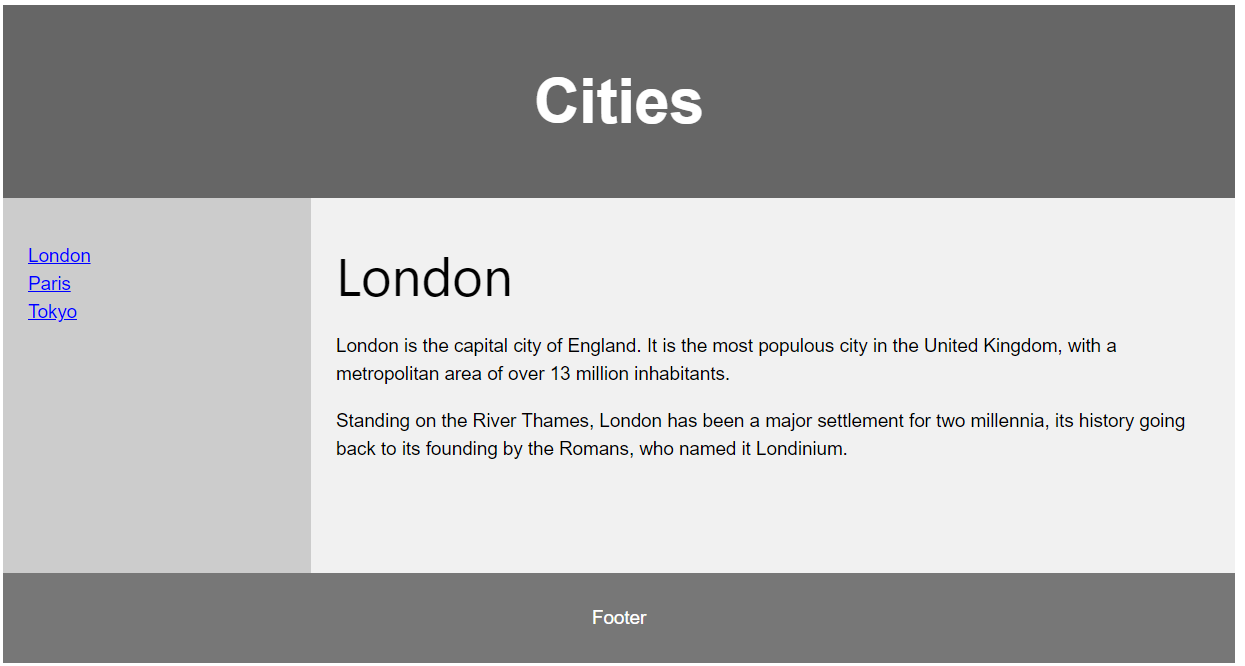
<p>In this example, we have created a header, two columns/boxes and a footer. On smaller screens, the columns will stack on top of each other.</p>
<p>Resize the browser window to see the responsive effect (you will learn more about this in our next chapter - HTML Responsive.)</p>
<header>
<h2>Cities</h2>
</header>
<section>
<nav>
<ul>
<li><a href="#">London</a></li>
<li><a href="#">Paris</a></li>
<li><a href="#">Tokyo</a></li>
</ul>
</nav>
<article>
<h1>London</h1>
<p>London is the capital city of England. It is the most populous city in the United Kingdom, with a metropolitan area of over 13 million inhabitants.</p>
<p>Standing on the River Thames, London has been a major settlement for two millennia, its history going back to its founding by the Romans, who named it Londinium.</p>
</article>
</section>
<footer>
<p>Footer</p>
</footer>
</body>
</html>Bố cục flexbox CSS
Flexbox là một chế độ bố cục mới trong CSS3.
Dùng flexbox đảm bảo các thành phần hoạt động có thể dự đoán được khi bố cục trang phải phù hợp với các kích thước màn hình khác nhau và các thiết bị khác nhau.
ví dụ
<!DOCTYPE html>
<html lang="en">
<head>
<title>CSS Template</title>
<meta charset="utf-8">
<meta name="viewport" content="width=device-width, initial-scale=1">
<style>
* {
box-sizing: border-box;
}
body {
font-family: Arial, Helvetica, sans-serif;
}
/* Style the header */
header {
background-color: #666;
padding: 30px;
text-align: center;
font-size: 35px;
color: white;
}
/* Container for flexboxes */
section {
display: -webkit-flex;
display: flex;
}
/* Style the navigation menu */
nav {
-webkit-flex: 1;
-ms-flex: 1;
flex: 1;
background: #ccc;
padding: 20px;
}
/* Style the list inside the menu */
nav ul {
list-style-type: none;
padding: 0;
}
/* Style the content */
article {
-webkit-flex: 3;
-ms-flex: 3;
flex: 3;
background-color: #f1f1f1;
padding: 10px;
}
/* Style the footer */
footer {
background-color: #777;
padding: 10px;
text-align: center;
color: white;
}
/* Responsive layout - makes the menu and the content (inside the section) sit on top of each other instead of next to each other */
@media (max-width: 600px) {
section {
-webkit-flex-direction: column;
flex-direction: column;
}
}
</style>
</head>
<body>
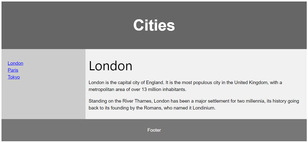
<h2>CSS Layout Flexbox</h2>
<p>In this example, we have created a header, two columns/boxes and a footer. On smaller screens, the columns will stack on top of each other.</p>
<p>Resize the browser window to see the responsive effect.</p>
<p><strong>Note:</strong> Flexbox is not supported in Internet Explorer 10 and earlier versions.</p>
<header>
<h2>Cities</h2>
</header>
<section>
<nav>
<ul>
<li><a href="#">London</a></li>
<li><a href="#">Paris</a></li>
<li><a href="#">Tokyo</a></li>
</ul>
</nav>
<article>
<h1>London</h1>
<p>London is the capital city of England. It is the most populous city in the United Kingdom, with a metropolitan area of over 13 million inhabitants.</p>
<p>Standing on the River Thames, London has been a major settlement for two millennia, its history going back to its founding by the Romans, who named it Londinium.</p>
</article>
</section>
<footer>
<p>Footer</p>
</footer>
</body>
</html>
Bố cục grid CSS
Mô đun bố cục grid CSS cung cấp một hệ thống bố cục dựa trên grid, với các hàng và các cột, làm nó dễ dàng hơn cho việc thiết kế các trang web mà không cần phải sử dụng float và định vị.
Học thêm về CSS grids trong chương CSS Grid View.
Tags:
Phản hồi từ học viên
5
(Dựa trên đánh giá ngày hôm nay)