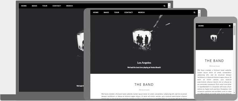
HTML Responsive Web Design - Thiết kế web phản hồi trong HTML
Thiết kế trang web phản hồi(responsive) là cách tạo ra các trang web có thể trực quan tốt trên tất cả các thiết bị.
Một thiết kế web responsive sẽ tự động điều chỉnh cho các kích thước và khung nhìn khác nhau.
Thiết kế web responsive là gì?
Thiết kế web responsive là sử dụng HTML và CSS để thay đổi kích thước, giấu, co lại hoặc phóng to một cách tự động cho một trang web để làm nó được hiển thị tốt trên tất cả các thiết bị (máy tính để bàn, máy tính bảng, và điện thoại):
<!DOCTYPE html>
<html>
<head>
<meta name="viewport" content="width=device-width, initial-scale=1.0">
<style>
* {
  box-sizing: border-box;
}
.menu {
  float: left;
  width: 20%;
}
.menuitem {
  padding: 8px;
  margin-top: 7px;
  border-bottom: 1px solid #f1f1f1;
}
.main {
  float: left;
  width: 60%;
  padding: 0 20px;
  overflow: hidden;
}
.right {
  background-color: lightblue;
  float: left;
  width: 20%;
  padding: 10px 15px;
  margin-top: 7px;
}

@media only screen and (max-width:800px) {
  /* For tablets: */
  .main {
    width: 80%;
    padding: 0;
  }
  .right {
    width: 100%;
  }
}
@media only screen and (max-width:500px) {
  /* For mobile phones: */
  .menu, .main, .right {
    width: 100%;
  }
}
</style>
</head>
<body style="font-family:Verdana;">

<div style="background-color:#f1f1f1;padding:15px;">
  <h1>Cinque Terre</h1>
  <h3>Resize the browser window</h3>
</div>

<div style="overflow:auto">
  <div class="menu">
    <div class="menuitem">The Walk</div>
    <div class="menuitem">Transport</div>
    <div class="menuitem">History</div>
    <div class="menuitem">Gallery</div>
  </div>

  <div class="main">
    <h2>The Walk</h2>
    <p>The walk from Monterosso to Riomaggiore will take you approximately two hours, give or take an hour depending on the weather conditions and your physical shape.</p>
    <img src="img_5terre.jpg" style="width:100%">
  </div>

  <div class="right">
    <h2>What?</h2>
    <p>Cinque Terre comprises five villages: Monterosso, Vernazza, Corniglia, Manarola, and Riomaggiore.</p>
    <h2>Where?</h2>
    <p>On the northwest cost of the Italian Riviera, north of the city La Spezia.</p>
    <h2>Price?</h2>
    <p>The Walk is free!</p>
  </div>
</div>


<div style="background-color:#f1f1f1;text-align:center;padding:10px;margin-top:7px;font-size:12px;"> This web page is a part of a demonstration of fluid web design made by w3schools.com. Resize the browser window to see the content respond to the resizing.</div>

</body>
</html>
Cài đặt khung nhìn
Để cài đặt một website responsive, thêm tiếp vào một thẻ <meta> cho toàn bộ các trang web của bạn:
ví dụ
<meta name="viewport" content="width=device-width, initial-scale=1.0"><!DOCTYPE html>
<html>
<head>
<meta name="viewport" content="width=device-width, initial-scale=1.0">
</head>
<body>
<h2>Setting the Viewport</h2>
<p>This example does not really do anything, other than showing you how to add the viewport meta element.</p>
</body>
</html>
Điều này sẽ cài đặt khung nhìn cho trang của bạn, thứ mà sẽ đưa cho trình duyệt một hướng dẫn về cách để điều khiển kích thước và tỉ lệ.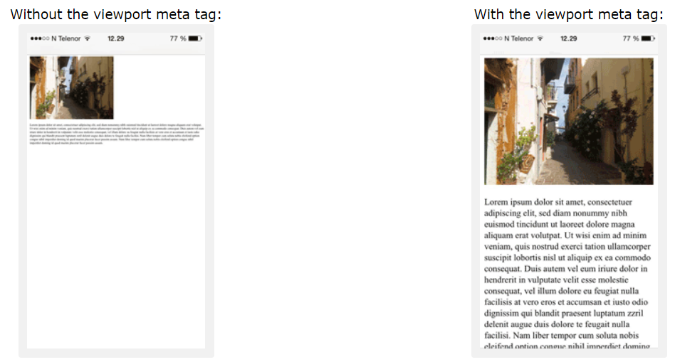
Hình ảnh phản hồi(Responsive Images)
Hình ảnh responsive là các hình ảnh có tỉ lệ vừa đẹp để phù hợp với mọi kích cỡ của trình duyệt.
Dùng thuộc tính width
Nếu thuộc tính CSS width được đặt thành 100%, hình ảnh sẽ phản hồi(responsive) và tăng, giảm tỉ lệ:

ví dụ
<img src="img_girl.jpg" style="width:100%;"><!DOCTYPE html>
<html>
<head>
<meta name="viewport" content="width=device-width, initial-scale=1.0">
</head>
<body>
<h2>Responsive Image</h2>
<p>When the CSS width property is set in a percentage value, the image will scale up and down when resizing the browser window. Resize the browser window to see the effect.</p>
<img src="img_girl.jpg" style="width:100%;">
</body>
</html>
Chú ý trong ví dụ trên, hình ảnh có thể được tăng tỉ lệ thành lớn hơn kích thước gốc của chính nó. Một giải pháp tốt hơn, trong nhiều trường hợp, sẽ được sử dụng thuộc tính max-width thay thế.
Sử dụng thuộc tính max-width
Nếu thuộc tính max-width được đặt thành 100% hình ảnh sẽ giảm tỉ lệ nếu nó phải làm thế, nhưng sẽ không bao giờ tăng tỉ lệ lớn hơn kích thước gốc của nó:
ví dụ
<img src="img_girl.jpg" style="max-width:100%;height:auto;"><!DOCTYPE html>
<html>
<head>
<meta name="viewport" content="width=device-width, initial-scale=1.0">
</head>
<body>
<h2>Responsive Image</h2>
<p>"max-width:100%" prevents the image from getting bigger than its original size. However, if you make the browser window smaller, the image will still scale down.</p>
<p>Resize the browser window to see the effect.</p>
<img src="img_girl.jpg" style="max-width:100%;height:auto;">
</body>
</html>
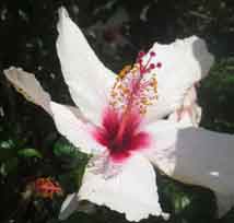
Hiển thị các hình ảnh khác nhau phụ thuộc vào chiều rộng của trình duyệt
Thành phần HTML <picture> cho phép bạn xác định các hình ảnh khác nhau cho các kích thước trình duyệt khác nhau.
Thay đổi kích thước trình duyệt để thấy cách mà hình ảnh bên dưới thay đôi phụ thuộc vào chiều rộng:
ví dụ
<picture>
  <source srcset="img_smallflower.jpg" media="(max-width: 600px)">
  <source srcset="img_flowers.jpg" media="(max-width: 1500px)">
  <source srcset="flowers.jpg">
  <img src="img_smallflower.jpg" alt="Flowers">
</picture>
<!DOCTYPE html>
<html>
<head>
<meta name="viewport" content="width=device-width, initial-scale=1.0">
</head>
<body>
<h2>Show Different Images Depending on Browser Width</h2>
<p>Resize the browser width and the image will change at 600px and 1500px.</p>
<picture>
<source srcset="img_smallflower.jpg" media="(max-width: 600px)">
<source srcset="img_flowers.jpg" media="(max-width: 1500px)">
<source srcset="flowers.jpg">
<img src="img_flowers.jpg" alt="Flowers" style="width:auto;">
</picture>
</body>
</html>
Kích thước văn bản phản hồi(Responsive Text Size)
Kích thước văn bản có thể được đặt với một đơn vị "vw", nghĩa là "viewport width(chiều rộng khung nhìn)".
Với cách đó kích thước văn bản sẽ theo kích thước của cửa sổ trình duyệt:
Hello World
Thay đổi kích thước của cửa sổ trình duyệt để thấy cách mà tỉ lệ kích thước của văn bản thay đổi.
ví dụ
<h1 style="font-size:10vw">Hello World</h1><!DOCTYPE html>
<html>
<head>
<meta name="viewport" content="width=device-width, initial-scale=1.0">
</head>
<body>
<h1 style="font-size:10vw;">Responsive Text</h1>
<p style="font-size:5vw;">Resize the browser window to see how the text size scales.</p>
<p style="font-size:5vw;">Use the "vw" unit when sizing the text. 10vw will set the size to 10% of the viewport width.</p>
<p>Viewport is the browser window size. 1vw = 1% of viewport width. If the viewport is 50cm wide, 1vw is 0.5cm.</p>
</body>
</html>
Khung nhìn là kích cở của cửa sổ trình duyệt. 1vw = 1% của chiều rộng khung nhìn. Nếu khung nhìn rộng 50cm, 1vw sẽ là 0.5cm.
Truy vấn truyền thông(Media Queries)
Trong trường hợp thay đổi kích cỡ của văn bản và hình ảnh, nó cũng phổ biến khi sử dụng các truy vấn truyền thông trong các trang web responsive.
Với các truy vấn truyền thông bạn có thể xác định hoàn toàn các phong cách khác nhau cho các trình duyệt khác nhau.
Ví dụ: Thay đổi kích thước cửa số trình duyệt để thấy 3 thành phần div bên dưới sẽ hiển thị theo chiều ngang trên màn hình và bị xếp chồng theo cột trên màn hình nhỏ:
ví dụ
<style>
.left, .right {
  float: left;
  width: 20%; /* The width is 20%, by default */
}

.main {
  float: left;
  width: 60%; /* The width is 60%, by default */
}

/* Use a media query to add a breakpoint at 800px: */
@media screen and (max-width: 800px) {
  .left, .main, .right {
    width: 100%; /* The width is 100%, when the viewport is 800px or smaller */
  }
}
</style>
<!DOCTYPE html>
<html>
<head>
<meta name="viewport" content="width=device-width, initial-scale=1.0">
<style>
* {
box-sizing:border-box;
}
.left {
background-color:#2196F3;
padding:20px;
float:left;
width:20%; /* The width is 20%, by default */
}
.main {
background-color:#f1f1f1;
padding:20px;
float:left;
width:60%; /* The width is 60%, by default */
}
.right {
background-color:#4CAF50;
padding:20px;
float:left;
width:20%; /* The width is 20%, by default */
}
/* Use a media query to add a break point at 800px: */
@media screen and (max-width:800px) {
.left, .main, .right {
width:100%; /* The width is 100%, when the viewport is 800px or smaller */
}
}
</style>
</head>
<body>
<h2>Media Queries</h2>
<p>Resize the browser window.</p>
<p>Make sure you reach the breakpoint at 800px when resizing this frame.</p>
<div class="left">
<p>Left Menu</p>
</div>
<div class="main">
<p>Main Content</p>
</div>
<div class="right">
<p>Right Content</p>
</div>
</body>
</html>Các trang web reponsive - ví dụ đầy đủ
Một trang web reponsive nên hiển thị tốt trên các màn hình máy tính lớn và trên các thiết bị điện thoại nhỏ.
<!DOCTYPE html>
<html>
<head>
<meta name="viewport" content="width=device-width, initial-scale=1.0">
<style>
* {
  box-sizing: border-box;
}
.menu {
  float:left;
  width:20%;
  text-align:center;
}
.menu a {
  background-color:#e5e5e5;
  padding:8px;
  margin-top:7px;
  display:block;
  width:100%;
  color:black;
}
.main {
  float:left;
  width:60%;
  padding:0 20px;
}
.right {
  background-color:#e5e5e5;
  float:left;
  width:20%;
  padding:15px;
  margin-top:7px;
  text-align:center;
}

@media only screen and (max-width:620px) {
  /* For mobile phones: */
  .menu, .main, .right {
    width:100%;
  }
}
</style>
</head>
<body style="font-family:Verdana;color:#aaaaaa;">

<div style="background-color:#e5e5e5;padding:15px;text-align:center;">
  <h1>Hello World</h1>
</div>

<div style="overflow:auto">
  <div class="menu">
    <a href="#">Link 1</a>
    <a href="#">Link 2</a>
    <a href="#">Link 3</a>
    <a href="#">Link 4</a>
  </div>

  <div class="main">
    <h2>Lorum Ipsum</h2>
    <p>Lorem ipsum dolor sit amet, consectetuer adipiscing elit, sed diam nonummy nibh euismod tincidunt ut laoreet dolore magna aliquam erat volutpat.</p>
  </div>

  <div class="right">
    <h2>About</h2>
    <p>Lorem ipsum dolor sit amet, consectetuer adipiscing elit.</p>
  </div>
</div>

<div style="background-color:#e5e5e5;text-align:center;padding:10px;margin-top:7px;">© copyright w3schools.com</div>

</body>
</html>
Thiết kế web reponsive - Frameworks
Có rất nhiều các CSS Framework cung cấp thiết kế reponsive.
Chúng miễn phí và dễ dàng để sử dụng.
Dùng W3.CSS
Một cách tuyệt vời để tạo các thiết kế reponsive, là sử dụng các dải phong cách reponsive, như W3.CSS
W3.CSS làm dễ dàng hơn trong việc phát triển trang web hiển thị đẹp trên mọi kích thước; máy tính để bàn, laptop, máy tính bảng, hoặc điện thoại:
W3.CSS Demo
Resize the page to see the responsiveness!
London
London is the capital city of England.
It is the most populous city in the United Kingdom, with a metropolitan area of over 13 million inhabitants.
Paris
Paris is the capital of France.
The Paris area is one of the largest population centers in Europe, with more than 12 million inhabitants.
Tokyo
Tokyo is the capital of Japan.
It is the center of the Greater Tokyo Area, and the most populous metropolitan area in the world.
ví dụ
<!DOCTYPE html>
<html>
<meta name="viewport" content="width=device-width, initial-scale=1">
<link rel="stylesheet" href="https://www.w3schools.com/w3css/4/w3.css">
<body>

<div class="w3-container w3-green">
  <h1>W3Schools Demo</h1>
  <p>Resize this responsive page!</p>
</div>

<div class="w3-row-padding">
  <div class="w3-third">
    <h2>London</h2>
    <p>London is the capital city of England.</p>
    <p>It is the most populous city in the United Kingdom,
    with a metropolitan area of over 13 million inhabitants.</p>
  </div>

  <div class="w3-third">
    <h2>Paris</h2>
    <p>Paris is the capital of France.</p>
    <p>The Paris area is one of the largest population centers in Europe,
    with more than 12 million inhabitants.</p>
  </div>

  <div class="w3-third">
    <h2>Tokyo</h2>
    <p>Tokyo is the capital of Japan.</p>
    <p>It is the center of the Greater Tokyo Area,
    and the most populous metropolitan area in the world.</p>
  </div>
</div>

</body>
</html>
<!DOCTYPE html>
<html>
<head>
<title>W3.CSS</title>
<meta name="viewport" content="width=device-width, initial-scale=1">
<link rel="stylesheet" href="https://www.w3schools.com/w3css/4/w3.css">
</head>
<body>
<div class="w3-container w3-green">
<h1>W3Schools Demo</h1>
<p>Resize this responsive page!</p>
</div>
<div class="w3-row-padding">
<div class="w3-third">
<h2>London</h2>
<p>London is the capital city of England.</p>
<p>It is the most populous city in the United Kingdom,
with a metropolitan area of over 13 million inhabitants.</p>
</div>
<div class="w3-third">
<h2>Paris</h2>
<p>Paris is the capital of France.</p>
<p>The Paris area is one of the largest population centers in Europe,
with more than 12 million inhabitants.</p>
</div>
<div class="w3-third">
<h2>Tokyo</h2>
<p>Tokyo is the capital of Japan.</p>
<p>It is the center of the Greater Tokyo Area,
and the most populous metropolitan area in the world.</p>
</div>
</div>
</body>
</html>
Bootstrap
Một framework nổi tiếng khác là Bootstrap, nó sử dụng HTML, CSS và jQuery để làm các trang web responsive.
ví dụ
<!DOCTYPE html>
<html lang="en">
<head>
<title>Bootstrap Example</title>
<meta charset="utf-8">
<meta name="viewport" content="width=device-width, initial-scale=1">
<link rel="stylesheet" href="https://maxcdn.bootstrapcdn.com/bootstrap/3.3.7/css/bootstrap.min.css">
<script src="https://ajax.googleapis.com/ajax/libs/jquery/3.2.0/jquery.min.js"></script>
<script src="https://maxcdn.bootstrapcdn.com/bootstrap/3.3.7/js/bootstrap.min.js"></script>
</head>
<body>

<div class="container">
  <div class="jumbotron">
    <h1>My First Bootstrap Page</h1>
  </div>
  <div class="row">
    <div class="col-sm-4">
      ...
    </div>
    <div class="col-sm-4">
      ...
    </div>
    <div class="col-sm-4">
    ...
    </div>
  </div>
</div>

</body>
</html>
Tags:
Phản hồi từ học viên
5
(Dựa trên đánh giá ngày hôm nay)